The Making of a Poster (Process Photos)
 Behind-the-scenes peeks of any creative endeavor, be it a movie, a painting, or in this case, a poster design, are always kinda cool to get a glimpse of…hopefully you’ll agree, and if not, there’s endless shots of cats on the Internet waiting just for you…and away we go!
* EDIT: Band management informed us that these SOLD OUT at the show and that this poster was “…one of mike’s favorite prints on the entire tour!” That’s nice to hear!
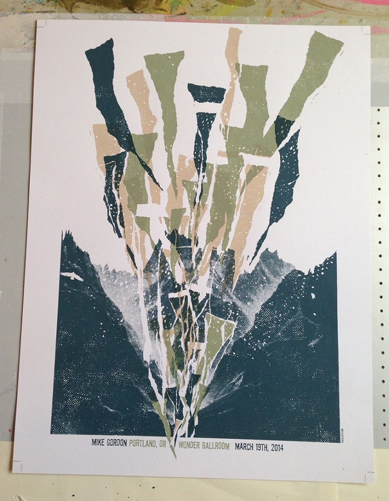
We were asked to create a poster for Mike Gordon‘s recent concert in Portland, Oregon (LOVE that place!). Full disclosure: This was not our first concept presented, but it was the one the client loved. We had very little time to turn this around, as is the case sometimes when it comes to these jobs.
The song “Long Black Line” off Mike’s new album was requested as a point of inspiration. There were a few lines in that song that inspired this design (you can figure that out).
This was an example of “seeing” the art in your head, even without a sketch to develop. Part of that process in this particular case was due to the extremely short deadline, but it works better that way sometimes. Pressure!
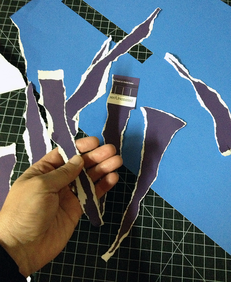
I had the idea that I wanted to not draw the elements I saw in my head, so I dug around in the flat files for some materials to inspire me and found these great old sheets from Letraset (some may remember them for rub down type back in the day) Pantone color sheets:
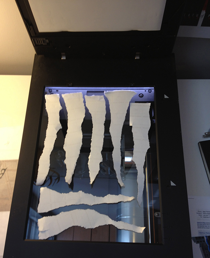
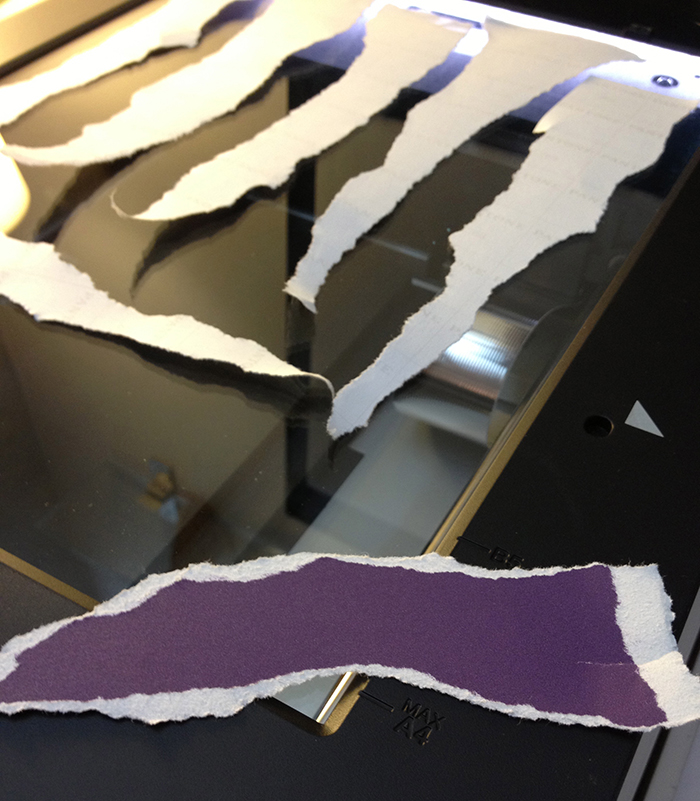
 Then it was a matter of ripping and shredding (always fun) a bunch of different shapes and sizes, then once I had a good collection of shapes that would work for the concept, all the pieces were scanned:
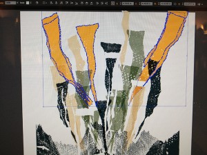
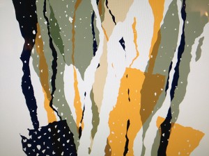
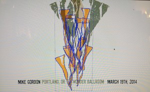
Once the scans were in the electronic world, I manipulated them with software that allowed me to keep the white torn edges, which was the detail I wanted to keep as part of each piece. Here’s an early stage photo or two (prior to the final color selections):
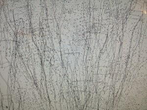 After the final colors were nailed down and the layout was finalized, color separations were done and then sent to the printer (in this case, the experienced hands of Fairweather Press in Oregon).
The remaining process was all about the INK on PAPER. Here is where the designer really wants a partner in a printer, and Fairweather came through with opacity suggestions and an eye for detail that we loved and really appreciated. Check out the images below that show the always interesting process of screen printing…
[imagebrowser id=6]
The final print result can be seen below Thanks so much for going along for the ride with us on this one! Limited edition prints can be purchased in the SHOP.
Images of printing process @ Fairweather Press 2014
