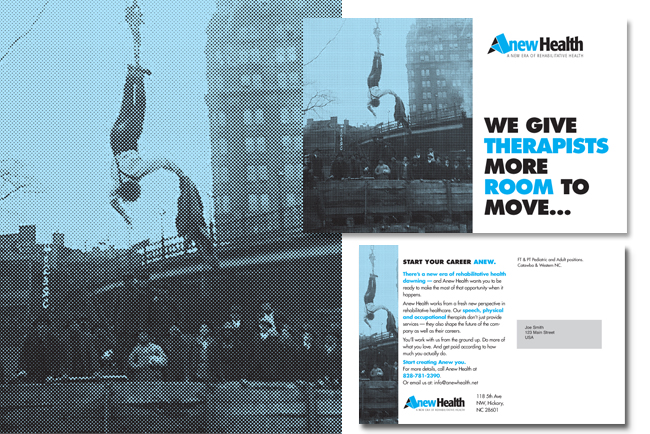
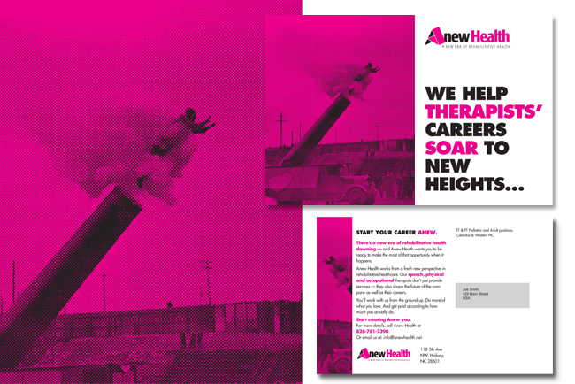
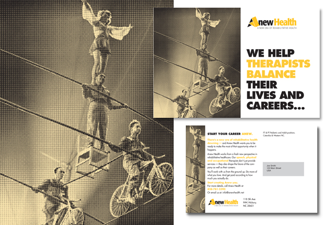
Anew Health logo and direct mail campaign design.

We recently designed a new logo and identity system for Anew Health, a company looking to rethink the recruitment process for rehabilitative healthcare professionals.
In addition to the logo design, we also got to help them create a three part direct mail campaign. Since most direct mail we get in the mail is full color and glossy and fancy shmancy, we convinced our client to try something (A)new (sorta old too) and different. We got to use some great archival black and white photography with spot colors added to tie in with the new identity. We’d like to think these would make the targeted audience stop for the 2 seconds of attention we have to fight to get!


