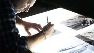
The Making of an Album Cover
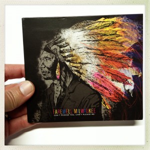
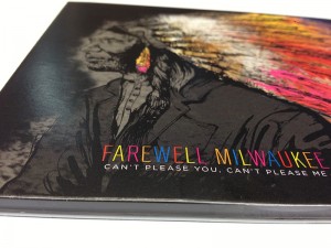 We wanted to share with you some of the creative process and behind-the-scenes work that goes into creating an album cover design, this one was for one our faves, Farewell Milwaukee, who just released “Can’t Please You, Can’t Please Me (get it here!).
The band had a fairly tight concept for this one, so we had a creative direction to go in, but needed to determine the best medium to achieve the feel the band wanted this cover to translate. After some discussions, it was agreed that an original illustration would translate really well and allow for some open interpretation for the fans as well.
Hope you enjoy the images, and please make sure to watch the “Making-of Album” video below. MAKE SURE to click on any image for a MUCH larger view.
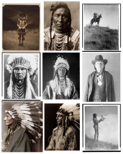
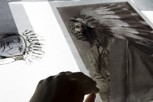
We started with TONS of reference material and research, some images found online, many found through the wonderful Library of Congress site (great source for amazing photo’s). Here’s a sampling of some of those great images:
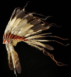
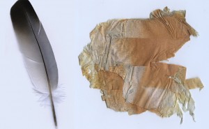
Next we started collecting items that had potential to either be inspiration or actual images and objects we either scanned or drew styles from (note: The bark we picked up was actually scanned and used as part of the final illustration):
Next we started to sketch some potential directions:
Some type studies didn’t make the cut, like this one where I tried to emulate the etched writings on those great old American West photographs.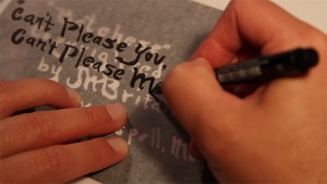
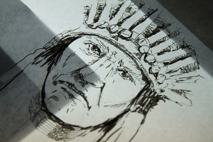
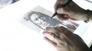
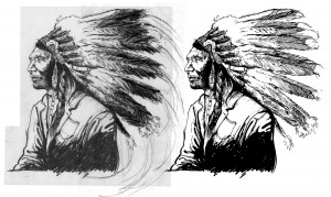
So at this stage we are getting very close, here’s the pencil to the inking stage for the finalized Indian chief for our cover:
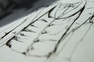
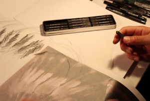
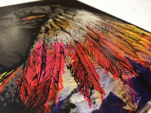
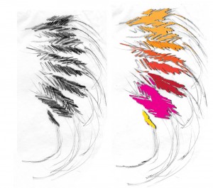
 …and some feather drawings with digital effects added:
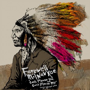
Here’s one version that will ONLY be seen here, we are getting closer…
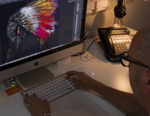
Editing and creating the digital portion of creating the art. I think at one point in the process, I had around 28 different layers in Photoshop to achieve the desired look.
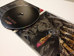
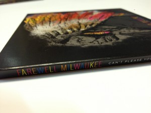
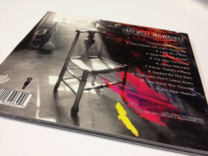
 Here’s the final cover as part of the finished digipak package design!
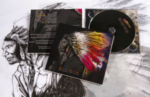 And here’s the gallery showing some more details, hope you guys enjoyed this process blog post!
