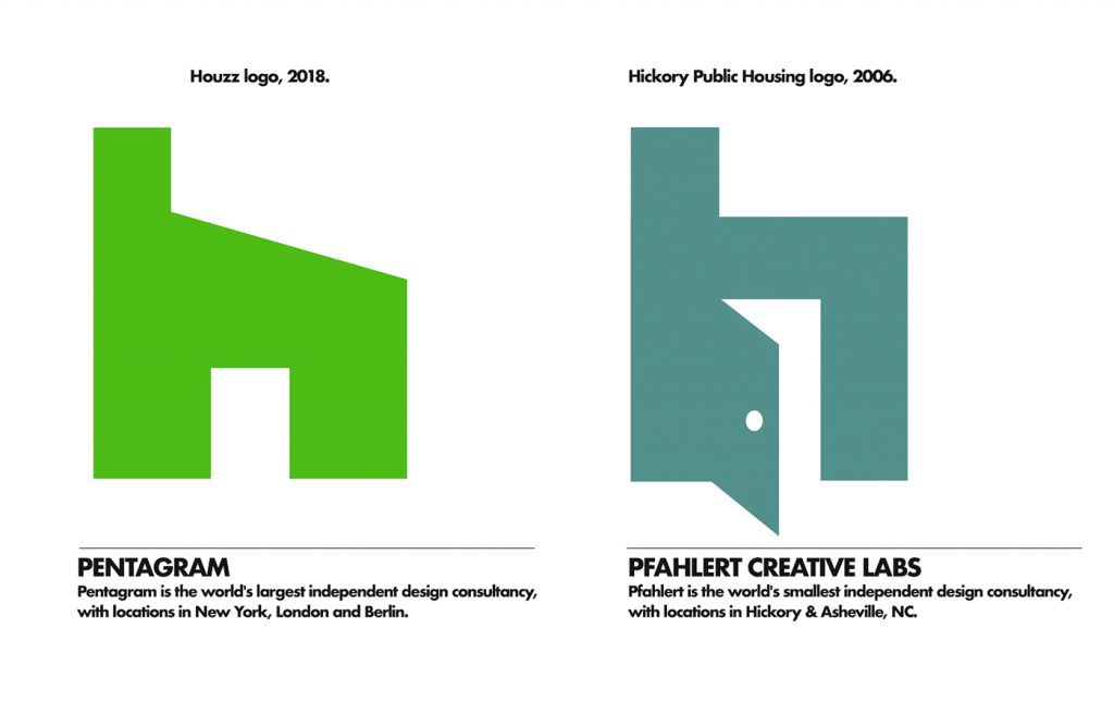
New Houzz logo – will ya just look at it.

If this was an Onion article headline, it would read: “Renowned graphic designer explains her creative process in coming up with a new emblem for a home design website: “The beach house needs a new porch.””
This week saw the introduction of totally new logo for Houzz, the $4 billion home decor platform. The company announced a new logo with a handy story behind it, designed by famed Pentagram designer Paula Scher. I love her work, the design for The Public Theater of New York? Amazing. Paula has zero clue who we are, none. Pentagram bills into the multi-multi-millions, our accounts are a bit smaller. At present, they have 345 thousand followers on Instagram. We have 1,788 as of this writing. All of this is just for context for this brief commentary. In the case of this logo, I can’t help but think that sometimes it just suffices to have a name in the industry and heck, you can sell anything to the customer.
Taking a positive slant on what appears to be a mostly negative reaction among designers to the Houzz logo (at least the comment sections I’ve seen), it at least reminds me that just because you’re a millionaire designer with a multi-millionaire firm, doesn’t mean all your work is going to be good. The new Houzz logo is not good, for many reasons, a few here:
• A bit clunky, lacking finesse, has an MS Paint feel (apologies to MS Paint).
• No inclusion of the unique ‘zz’ spelling of the company name?
• The icon has odd proportions, it lacks the visual interest of the previous logo.
• Whole lotta conflict between the logo angular style and typeface choice.
…you get the idea. And yes, these are just my opinions, and as stated previously, who the heck am I? NOT Paula Scher, that’s who.
I’ve been on the other side plenty here too: People saying publicly that they don’t like my work and “Your new logo is not good” and “Please stop making art”, etc., …it’s hard not to take it personally, since, hey, it is your work, your ideas, your blood, sweat and tears (amount of tears and whether there’s blood in the tears depends on client).
All this to say: The logo we created for Hickory Public Housing in 2006 is a better logo than the million dollar Houzz logo. There, that feels good.
-The Silent P