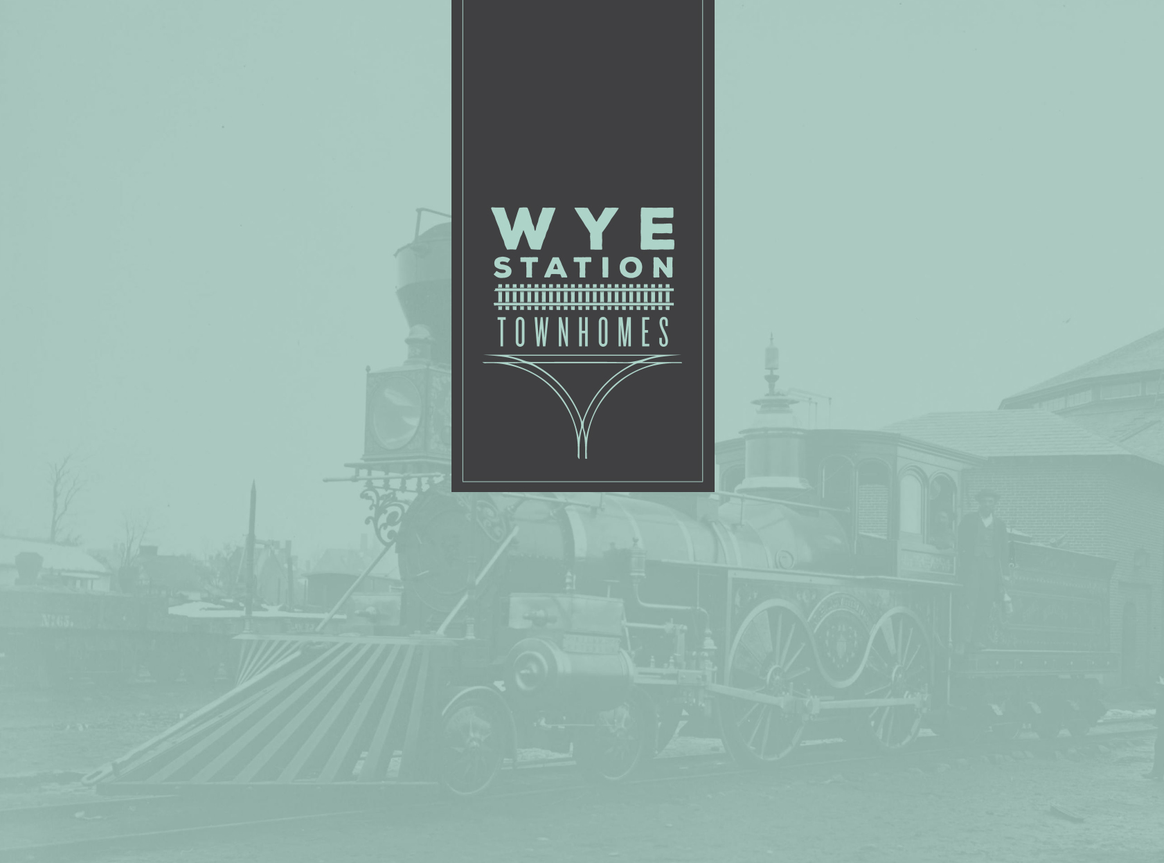
Wye Station Branding

![]()
![]()
![]()

CLIENT: Wye Station Branding Design
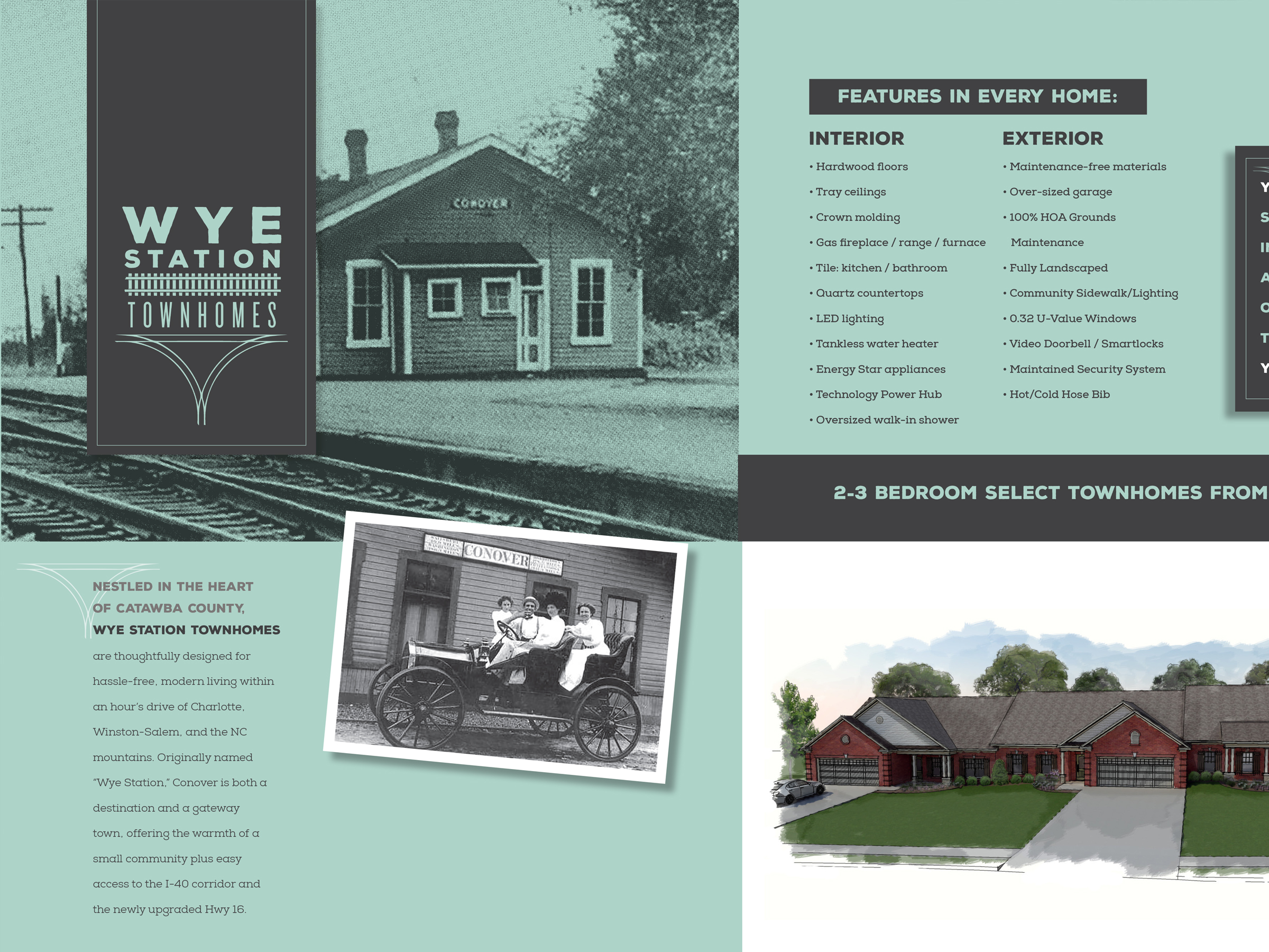
Complete branding package for a new development in Conover, NC. The City of Conover was originally called Wye Town, because it began to develop in the mid 1800s as a “Y” intersection of the railroad traversing North Carolina. In railroad structures, and rail terminology, a wye (like the ‘Y’ glyph) or triangular junction is a triangular joining arrangement of three rail lines with a railroad switch (set of points) at each corner connecting to each incoming line.
Project included creative direction, art direction, print design and web design.
- Advertising
- Brochures
- Design
- Identity