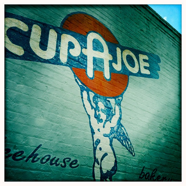
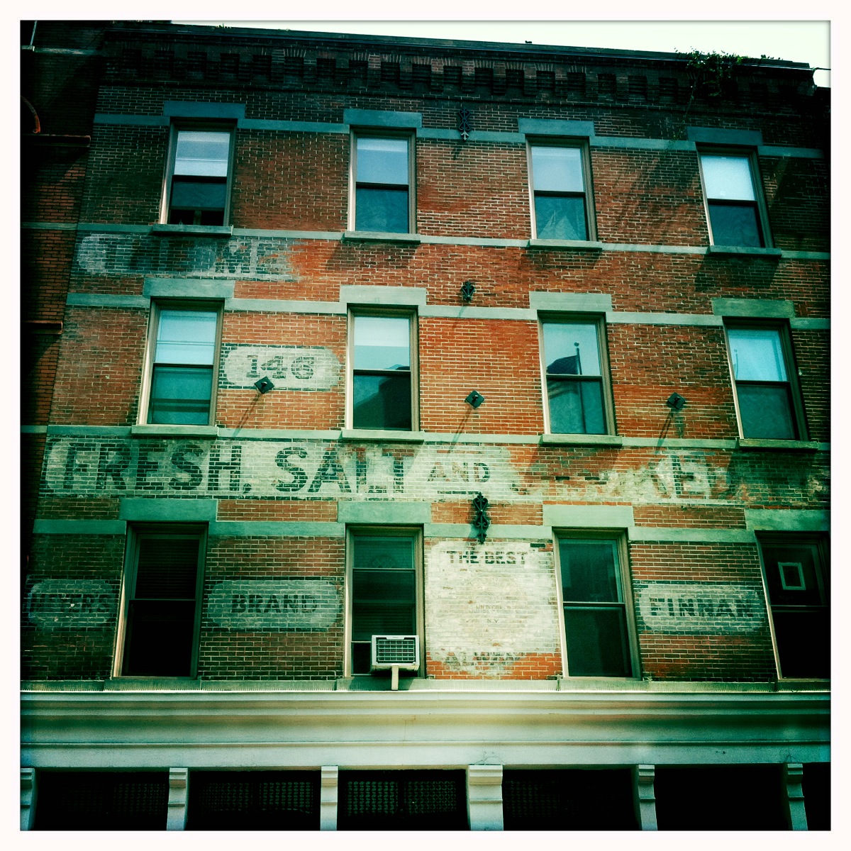
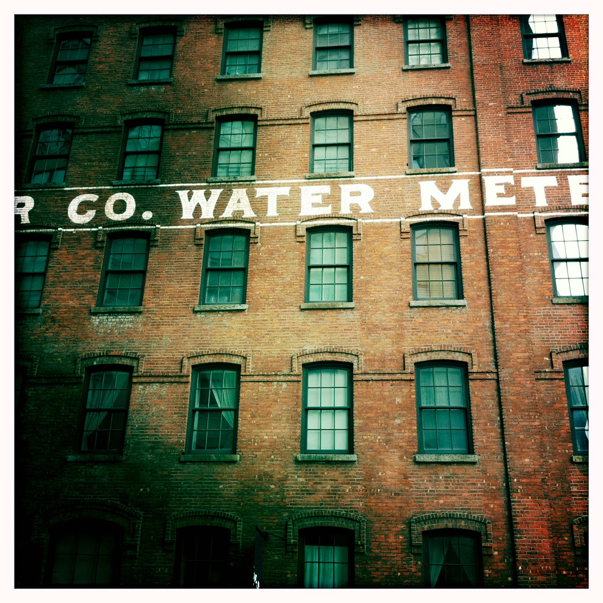
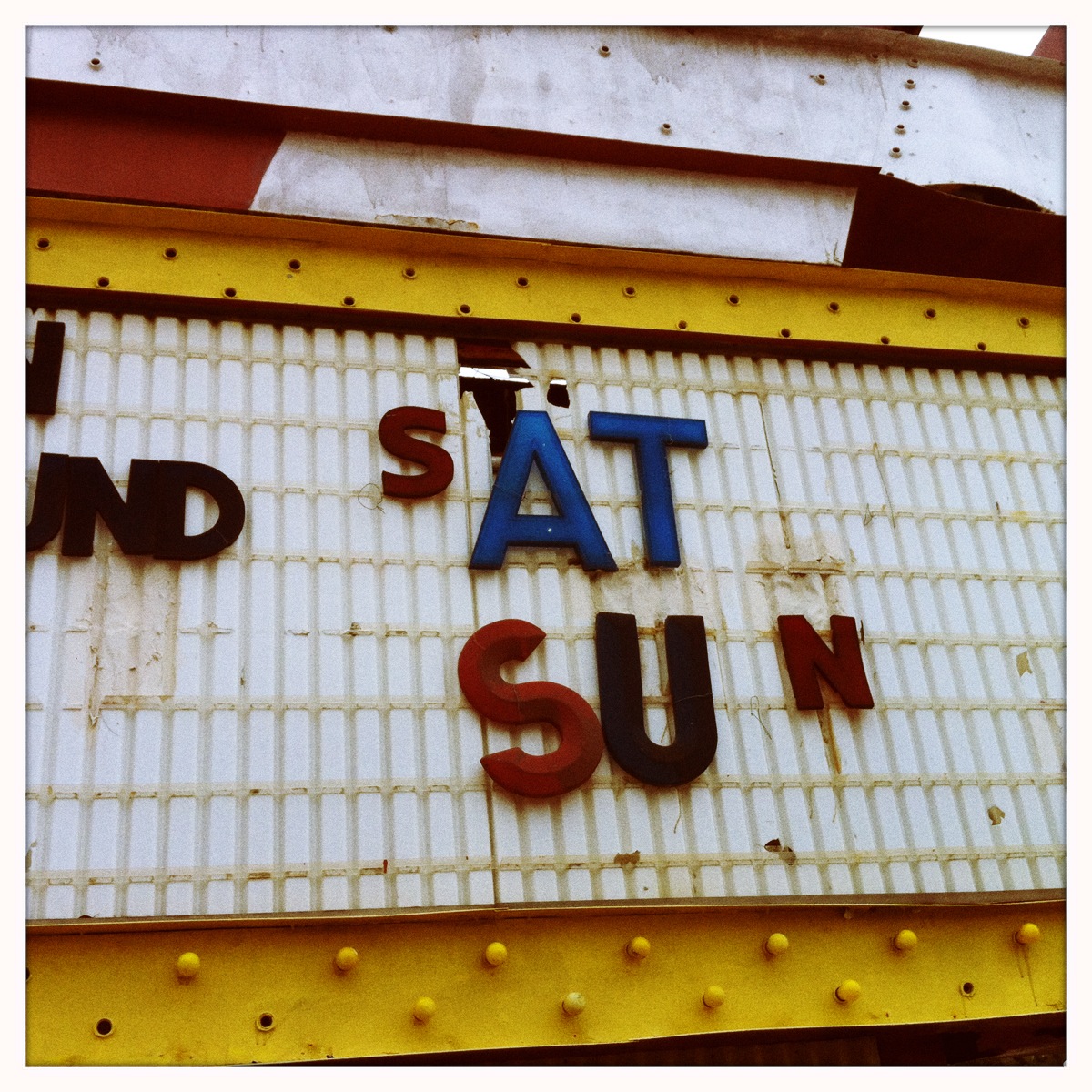
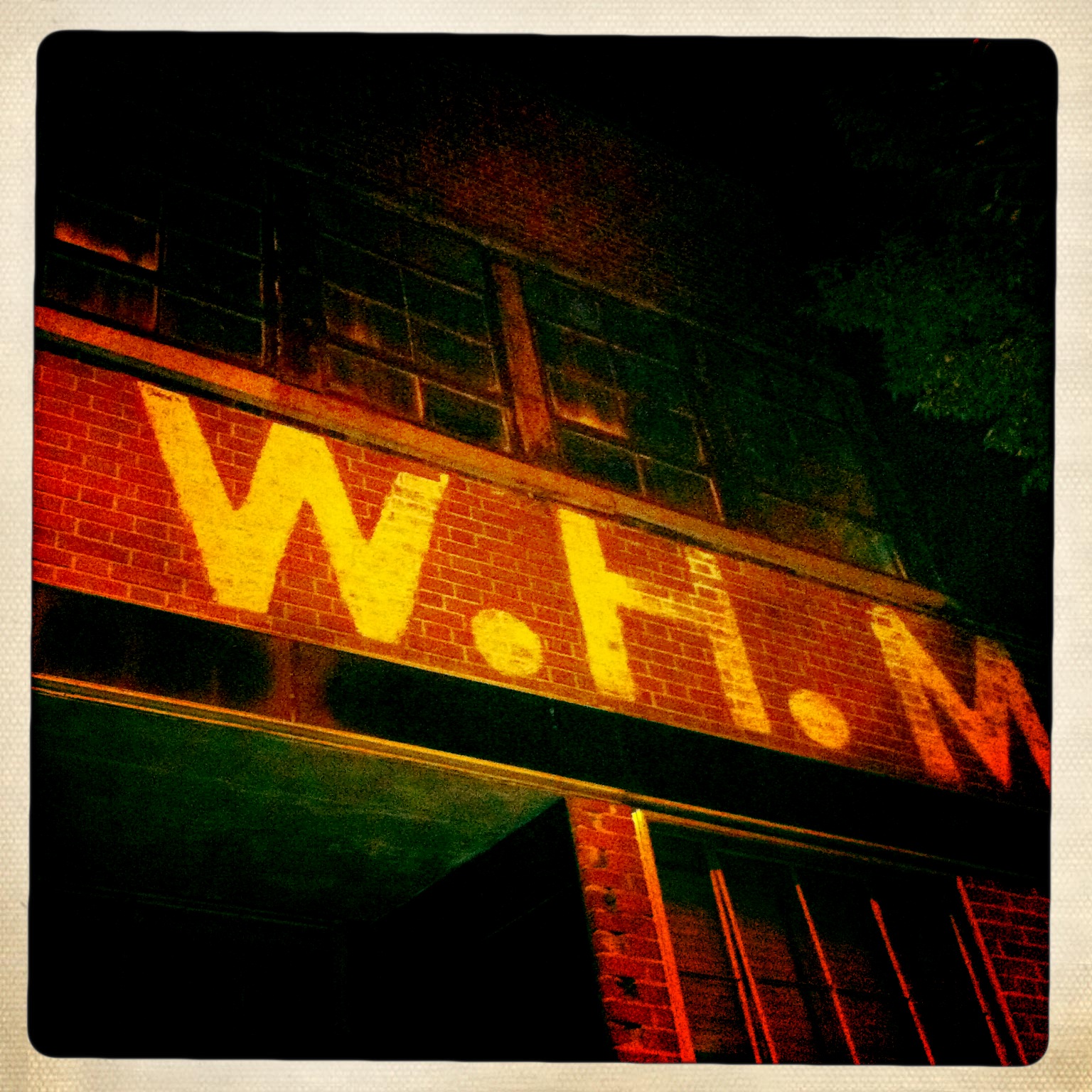
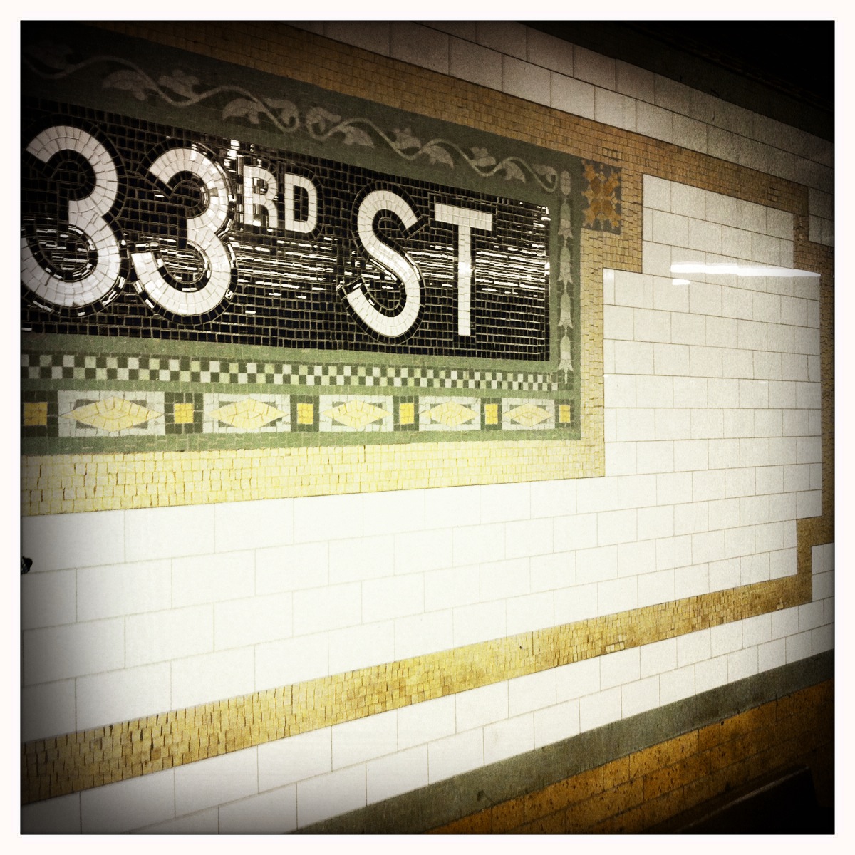
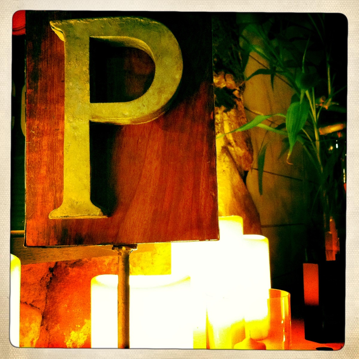
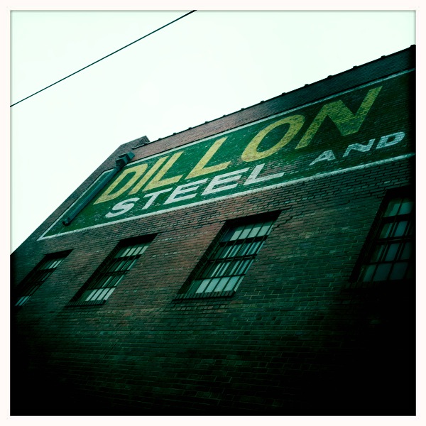
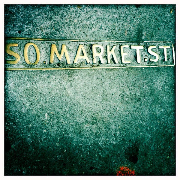
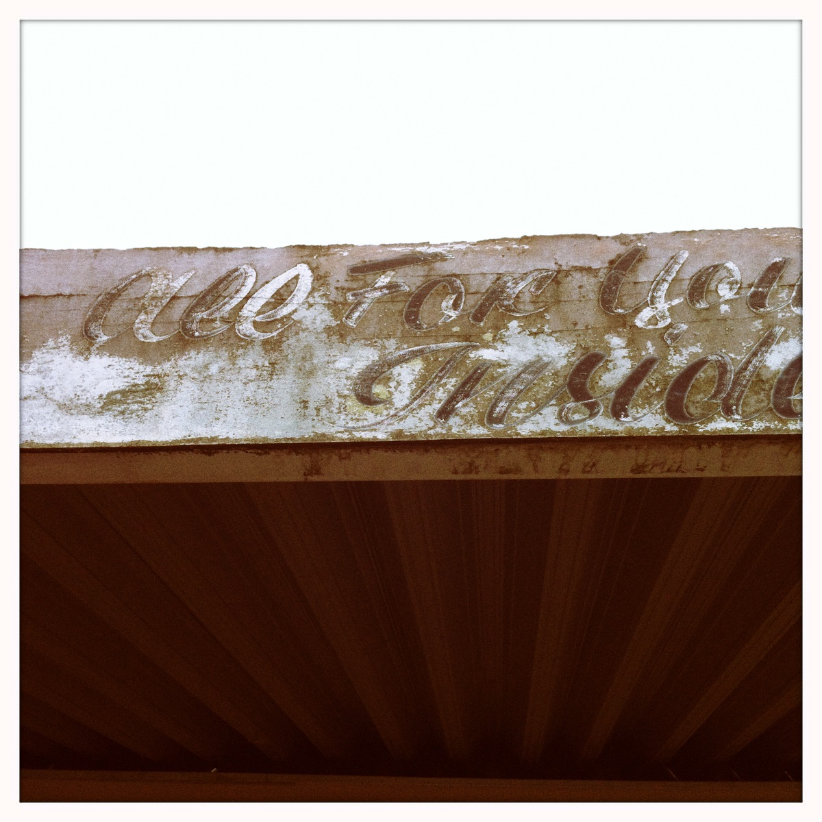
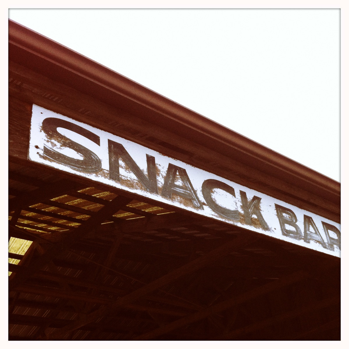
Appreciating The Imperfect (and Hand-Done) Typography Around You.
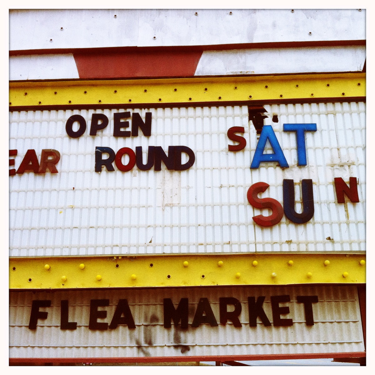
On a recent trip to our local Flea Market, we saw all sorts of fun and interesting items (edible cactus for one!). We also really dug all the hand painted old signs around the location. Here’s a selection of some sweet work that we think is more interesting than the “perfect” fonts and typography found on all computers and in your own downtown and neighborhood.
David Carson is well known for the quote: “Don’t mistake legibility for communication.” He has written about his appreciation for the ripped up and layered paper and partial typography on billboards, the ones awaiting new “perfect” shiny graphics, revealing all the more visually interesting layers and texture, “the ugly underneath”.
We encourage you to take a fresh look at the type around you on any given day…what’s more visually interesting and engaging in this era of “perfect” computer work? Look in any design annual (Print Regional is always good, albeit a LOT thinner lately) and you’ll see the trend among designers for a while now is hand done type and text. It’s great to see in our opinion.
Now, go make some messy yard sale signs and be creative…just don’t make it perfect.
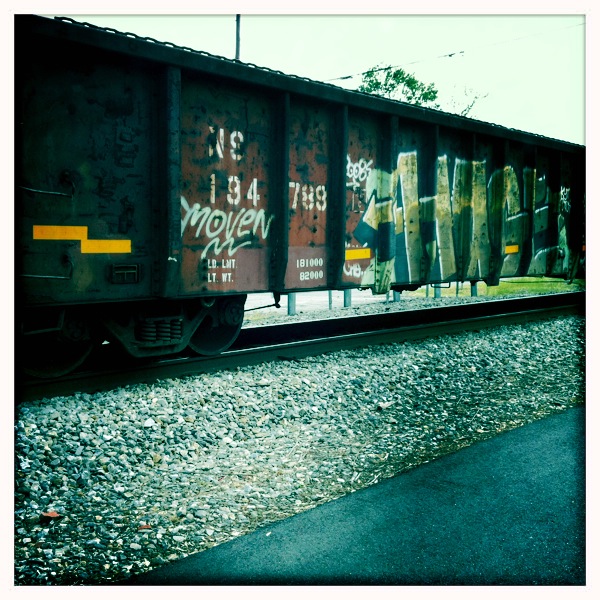
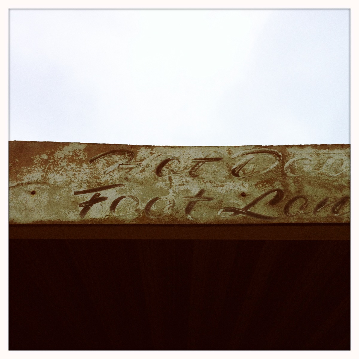
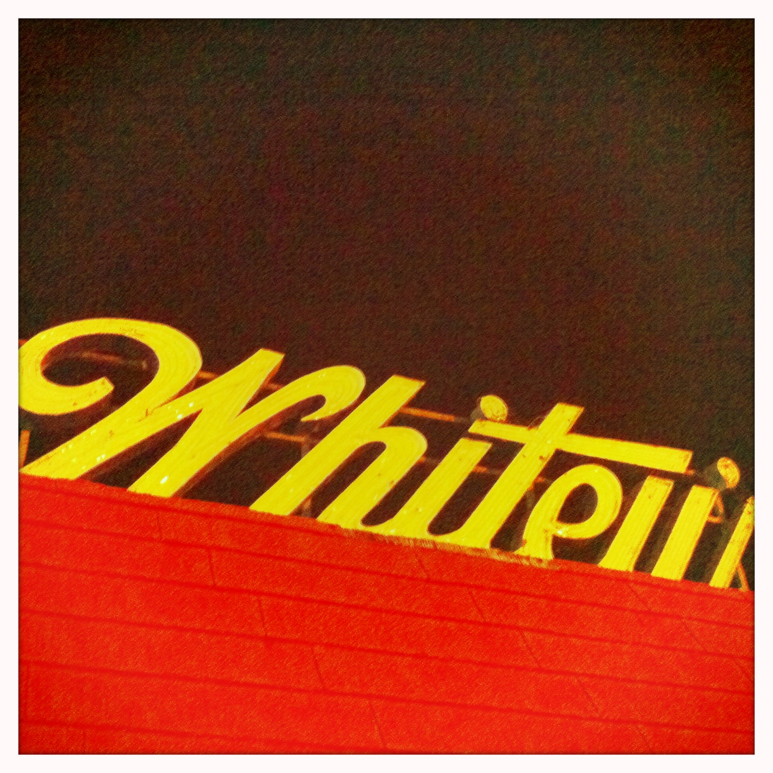
Enjoy the gallery of photographs we’ve taken of typography that caught our eye at one time or another (we have TONS like these we’ll hopefully post later).
All photography © The Silent P // Pfahlert Creative Labs // 2012 //