Draplin Drones Defined
WARNING: The following includes design commentary humor, most of which is tongue-in-cheek, you can figure the parts out that aren’t.
#DraplinDrone – {dræp-lin drōn} – noun. A graphic designer sporting a thick ‘Yeard’ {one year of growing your beard, without trimming it, shaving it} commonly seen in the wild wearing trucker hats with patches associated with any variety of outdoor brands, matched with black logo mark t-shirts, commonly featuring unknown bands or record labels long out of print, denim jackets and of course, last but not least…flannel. Designs icons and logos derivative of Draplin – not uncommon for the work to look very similar to many Pacific Northwest based graphic designers. Impressively interchangeable with numerous other accounts publishing similar graphic design work. Most have Dribbble accounts easily confused with other #DraplinDrones. Typeface choices are commonly thick, sans serif fonts – regardless of legibility or relation to specific project. “You need a Funeral Home logo? Futura Extra Bold!”. Known natural habitats are: Craft breweries, flea markets {always on the look out for genuine graphic design applied to kitsch}, independently owned coffee shops, record vinyl stores & ironic visits to Walmart.
For the record, I’m guilty of 6 of the above 🙂
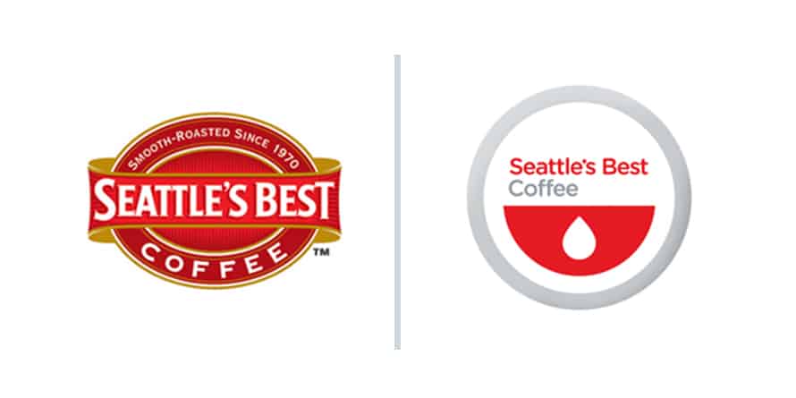
In a related note, there was a great article about bad brand redesigns recently on Adweek‘s site (“5 Brand Logo Redesigns That Pissed People Off”). One in particular reminded me of what inspired this somewhat tongue-in-cheek design commentary. In part, the logo redesign that reminded me of the trend to follow a popular designer’s style regardless of the job was the one for Seattle’s Best coffee. see it below:
In part, the article states: “A logo that advertises food or beverages should look, well, appetizing. This tough-on-the-eyes Seattle’s Best redesign from 2010 looks like an advert for a blood drive. Which is fine if you’re a vampire. But somehow I have a feeling that’s not the company’s dominant customer base. Opponents of Seattle’s Best rendering in the design world called it “too clinical” and the Seattle Weekly called it a “cross between Target and the Red Cross.” Critics said the coffee brand’s previous logo had a nostalgic, vintage feel that consumers cherished, while the new design was too generic to invoke fond memories, and could have been advertising pretty much anything.”
I guess that’s the danger of somewhat blindly following the style & look that popular designers may set as the style of the day. This apparent trend reminds me of an earlier post we created, another somewhat tongue-in-cheek Draplin themed design commentary found here: “What If Draplin Designed It?”
#designcommentary #designhumor #pleaselaughatyourself #isaidplease #prettyplease?
-The Silent P
