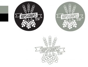
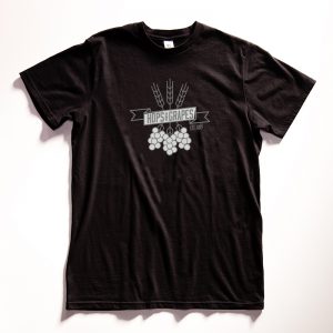
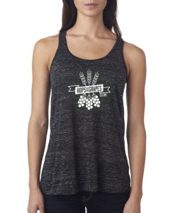
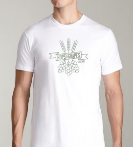
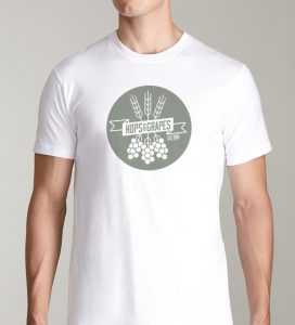
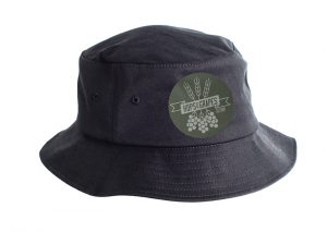
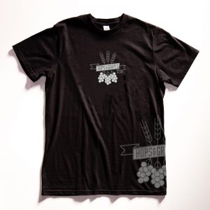
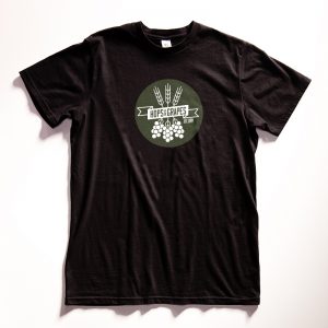
Rejected Logo, Hey – Go Find Yourself a Home.
Every designer has at some point thought: “Man, I could totally improve so-and-so’s logo SO much!” Sometimes that desire leaves the creative little choice but to go ahead and create their own version of the new logo and branding out of a desire typically born from appreciating what the company or brand is doing (or trying to do), in hopes that just maybe the potential client ‘Gets It’ – or even better, LOVES it!
Which brings us to now. We created a new logo and brand for a local beer shop we love, but as of now, it has been lost in all the hops and grapes. So, if you or anyone you know is looking for a great logo mark relating to beer and wine for a GREAT price, please let us know, we are happy to give this thing away for a great bargain, just to see it be happy and shiny in a new home.
Some points made in our presentation on this new mark were:
• Follows solid basic design principles
• Is very functional
• Represents the company well
• Is unique
The new look is professional, and is custom. New logo utilizes solid design principles like balance and repetition. In other words, it’s attractive.
Strong visual. No clutter. Modern, up to date feel. Strong lines. The logo is appealing in its simplicity & quickly communicates to consumers what to expect.
Works excellently in two colors as well as one color.
Call 828-261-0075 or email us at: info@staging.thesilentp.com
