Posts by The Silent P
Appreciate the Process.
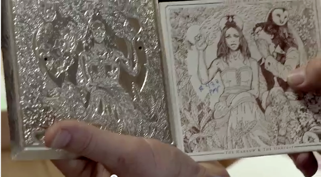
Bit of a re-post here: Highly recommend this video of the making of Gilian Welch’s latest release “The Harrow & The Harvest”. You really appreciate the work & process involved in making something unique and special. Let’s repeat that: You really appreciate the work & process involved in making something unique and special. Windmill presses, Ink,…
Read MoreSaul Bass Tells It Like It Is.
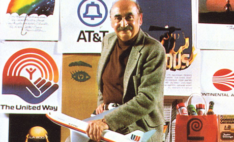
Short and (bitter)sweet this week: We lost an account that we were pitching… An account that we as a team (we partnered with another firm we love) really wanted and had a great feeling about. The project went elsewhere, and of course we feel like the decision was not in the best interest of the…
Read MoreMade in America: Our House Furniture Design
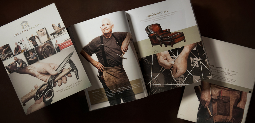
We recently finished a 126 page print catalog for Our House Designs, Inc., a furniture company based in the foothills of North Carolina. During the process of working on the project, which included on location photo shoots, interviews with employees and research, we really appreciated how special this type of company is these days: “Made…
Read MoreArt Print Concept // Paul Rand Quote
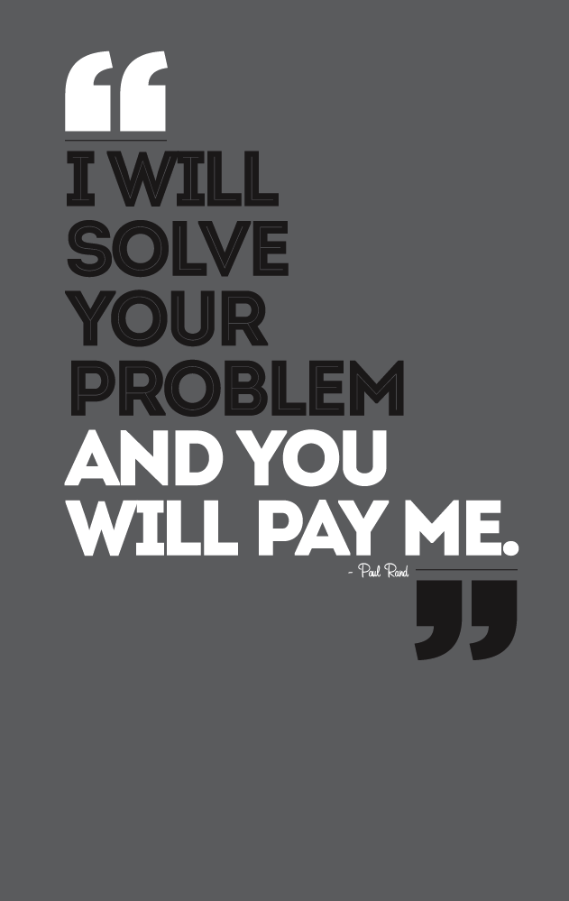
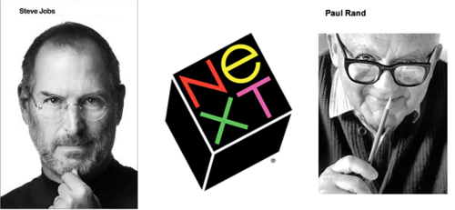
Kinda love this quote from the well known graphic designer Paul Rand. So much so that I think it will make a great art print…what do you think? You can read our entry about the now infamous story here. Here’s what we’re thinking: Two color print: White ink // Silver Metallic ink on French Paper…
Read MoreThe Band of Heathens Print and Poster Design
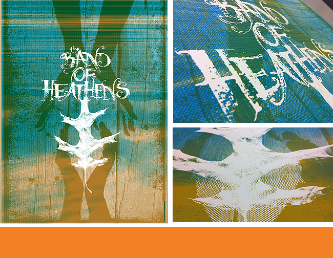
From Austin, Texas comes The Band of Heathens. The guys contacted us to produce a tour poster design and screen print, as well as a digital version for use as a limited online release EP cover (see images below). Great print run again from our friends over at The Half & Half. We used the…
Read More“I will solve your problem and you will pay me.”
– Paul Rand I recently finished the Steve Jobs biography by Walter Isaacson, and besides being an insightful look into the man, it’s full of really interesting stories relating directly to advertising and design. Classics like the “Think Different” campaign are in there, the story behind the best Super Bowl commercial ever, “1984”, and Jobs…
Read MorePoster Art Created for Eric Church Event.
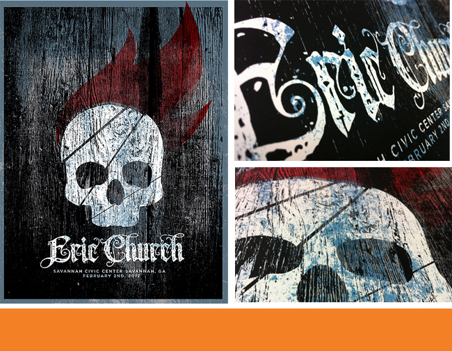
It was fun creating the imagery for Eric Church‘s event poster for his Savannah, GA show, seen here. It includes some scanned rough wood texture, custom typography work, silver metallic ink, and a SKULL! It’s probably the most ‘metal’ poster we’ve done, and it’s for a country music star…some call it “Outlaw Country.” Buy your print…
Read MoreAppreciating The Imperfect (and Hand-Done) Typography Around You.
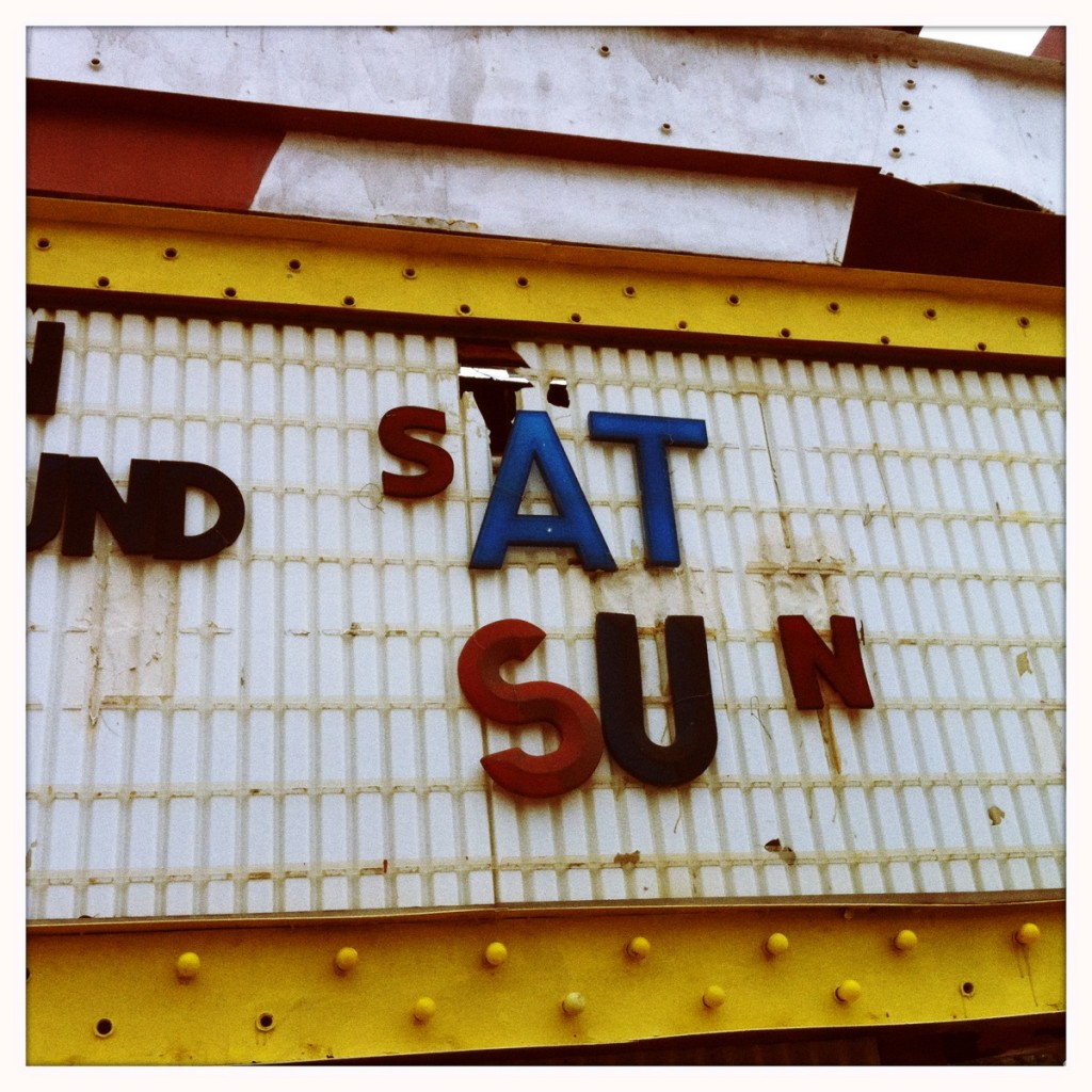
On a recent trip to our local Flea Market, we saw all sorts of fun and interesting items (edible cactus for one!). We also really dug all the hand painted old signs around the location. Here’s a selection of some sweet work that we think is more interesting than the “perfect” fonts and typography found…
Read MoreCoffee Never Smelled, Tasted or Looked So Good.
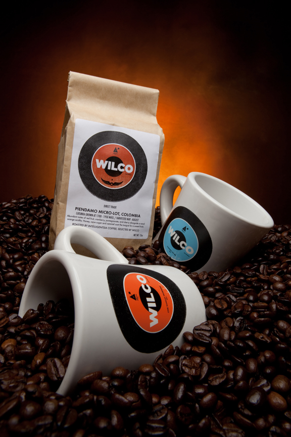
We were recently asked to design Wilco’s latest coffee mugs. It was fun creating the two sided design, which highlights two of Wilco’s songs on the new album The Whole Love. On one side we have “One Sunday Morning”, the other has “Dawned On Me” on the record art created. Check out the images below to see…
Read MoreProphecy of New Website in 2012 Comes True.
FOR IMMEDIATE RELEASE: We have an all new customizable website. Holy crap. You (the user) can change the way our website looks! Wait, is that right? We don’t like making predictions, but it would seem just plain wrong that after all the work we’ve put in during 2011 and now finally releasing an all new website…
Read More