Uncategorized
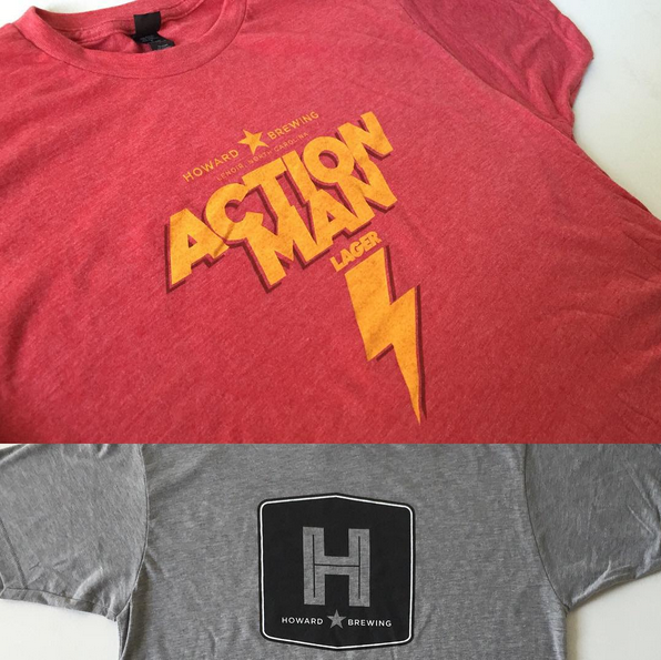
Howard Brewing T-shirts = Frothy Goodness
Happy Friday, time for brand new @howardbrewing t-shirts. #ncbeer #design #beerbranding. Great #ink by #screenprinting gurus @inkfloyd ! A photo posted by Matt Pfahlert (@the_silent_p) on Oct 23, 2015 at 11:16am PDT
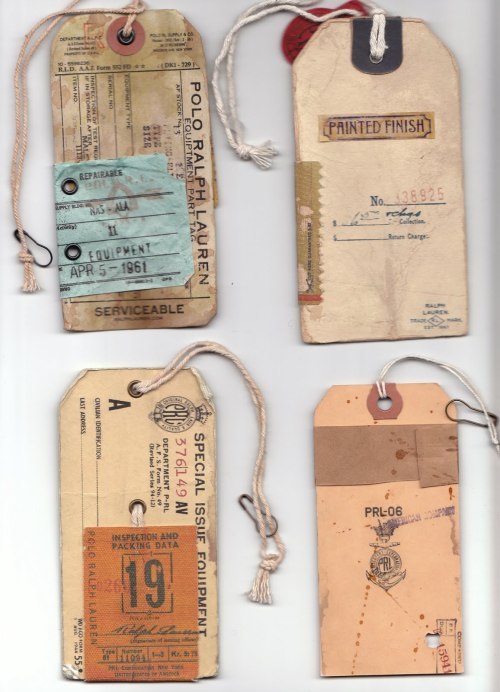
Read MoreVintage Branding of the Ralph Lauren Polo Collection
We are really loving the vintage branding of the Ralph Lauren Polo collection. The depth of the brand woven through each hangtag through deeply complex and diverse graphics. Individually, each hang tag tells the brand story, and paints a picture of the lifestyle you are buying into. Enjoy these great samples of design done well…
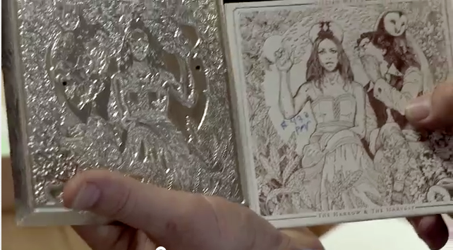
Read MoreAppreciate the Process.
Bit of a re-post here: Highly recommend this video of the making of Gilian Welch’s latest release “The Harrow & The Harvest”. You really appreciate the work & process involved in making something unique and special. Let’s repeat that: You really appreciate the work & process involved in making something unique and special. Windmill presses, Ink,…
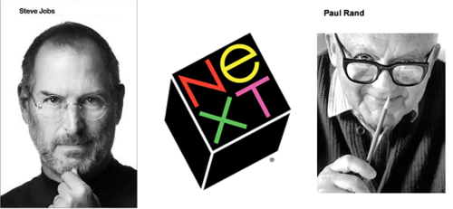
Read More“I will solve your problem and you will pay me.”
– Paul Rand I recently finished the Steve Jobs biography by Walter Isaacson, and besides being an insightful look into the man, it’s full of really interesting stories relating directly to advertising and design. Classics like the “Think Different” campaign are in there, the story behind the best Super Bowl commercial ever, “1984”, and Jobs…
Read MoreProphecy of New Website in 2012 Comes True.
FOR IMMEDIATE RELEASE: We have an all new customizable website. Holy crap. You (the user) can change the way our website looks! Wait, is that right? We don’t like making predictions, but it would seem just plain wrong that after all the work we’ve put in during 2011 and now finally releasing an all new website…
Read MoreKatharine Whalen’s Album Art Part of “Album Covers of the Year”.
We are really happy to announce that our album art and design for Katharine Whalen and her Fascinator’s CD “Madly Love” is getting some mad love over at Seattle’s own REDEFINE Magazine. The album cover has been included in their year end article “Album Covers of the Year 2011”. The article includes some nuggets from…
Read MoreThe Silent P vinyl sticker is here, spreading love to one and all.
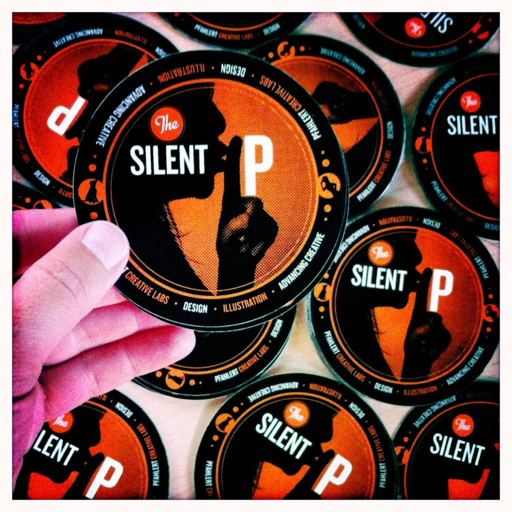
“The Silent P” vinyl sticker is perfect for the following uses: 1. Small and large boats 2. Small and large cars 3. Go Carts 4. Foreheads (large and small) 5. Your sibling 6. Bridges and overpasses (you have to pay the fine though) 7. On top of other less impressive stickers 8. Drum sets 9.…
Read MoreJOWLS.
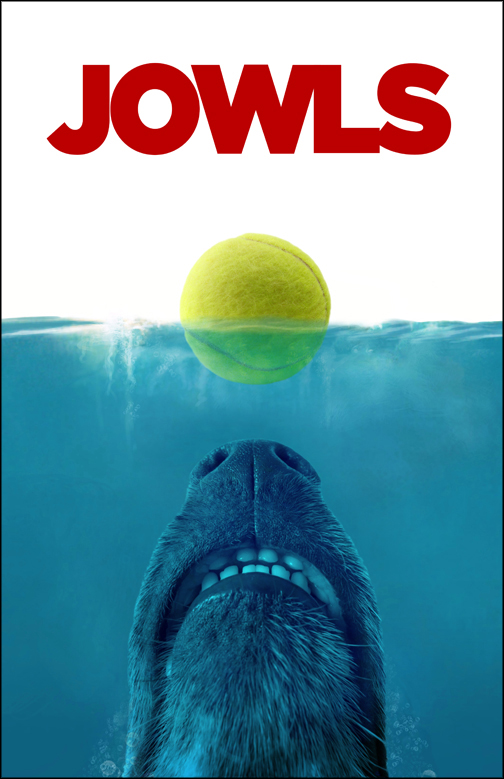
After we shared a really cool photograph of a dog’s snout taken by our friend Jon Eckard on Facebook, the magic of social media started to happen…Mark Pfahlert (big brother to Matt) was immediately reminded of the classic movie poster for “JAWS”, with a twist (of the tail). See the hilarious results below… Jon’s original…
Read MoreShhh, The Silent P is almost here.
We are excited to share some cool news: First, our new website that has been in development for a while now is CLOSE to being opened for business! Along with that, we will be introducing “The Silent P”…From what we hear about The Silent P, “it will change the way you perceive the world without…
Read MoreNew Album Packaging Design for Farewell Milwaukee.
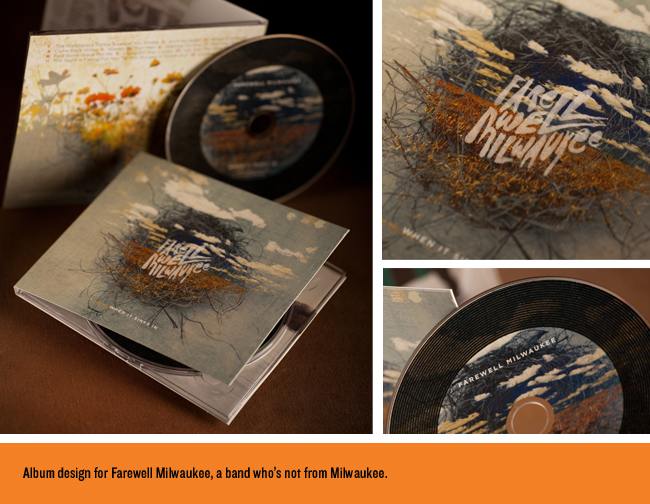
We were thrilled to be working with Farewell Milwaukee on their latest album release “When It Sinks In.” This is a band you should get to know if you have not already. They are from Minneapolis, MN, (don’t let the name fool you). We hope for big things from these great guys! While designing and conceptualizing images…
Read More