Posts Tagged ‘detail’
Wilco Poster Process.
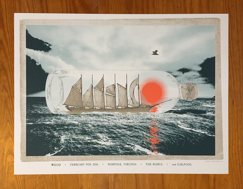
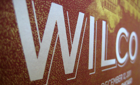
Please indulge us in a little process post for The Silent P’s latest poster art created for the amazing band Wilco. For those with shorter attention spans, below is the entire process represented in a handy image gallery. Below the gallery is a more expansive detailed description of the process. We’d like to thank Dan…
Read MoreAppreciating The Imperfect (and Hand-Done) Typography Around You.
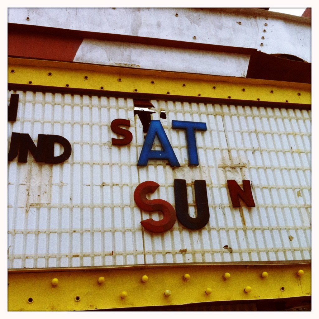
On a recent trip to our local Flea Market, we saw all sorts of fun and interesting items (edible cactus for one!). We also really dug all the hand painted old signs around the location. Here’s a selection of some sweet work that we think is more interesting than the “perfect” fonts and typography found…
Read MoreWilco’s Incredible Shrinking Tour of Chicago Poster Series
One of our favorite music clients and bands asked us to help create a complete poster series for “Wilco’s Incredible Shrinking Tour of Chicago”. Five dates, five different venues in Chicago. The deadline to accomplish the project was insane, to say the least. With help from some of our friends (you know who you are),…
Read MoreThe Gateway Arch, Water and Wilco.
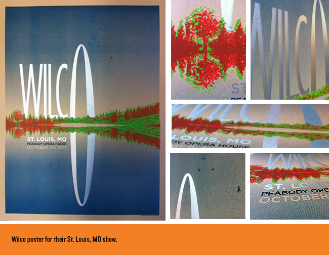
We recently finished up a poster design for Wilco’s October 4th show in St. Louis, MO. One of those little birdies to the right of the arch told us that these sold out at the show. Below are some of the process shots, details and even the initial idea as we sketched it out. Sometimes…
Read MoreWe have new buttons! The bling may be too much to handle…
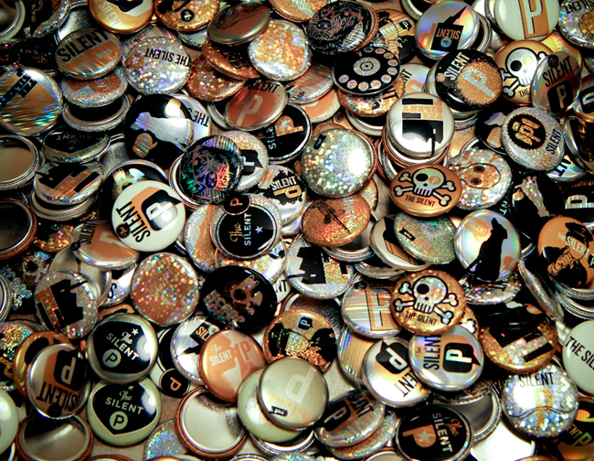
These bad boys are on the way to us right now, but the bling off these may be too much for human eyes to handle. An assortment of special effects are included: sparkle dust, glow in the dark, standard metallic + a few surprises! The Silent P is one step closer to world domination…or a new…
Read MoreNew Album Packaging Design for Farewell Milwaukee.
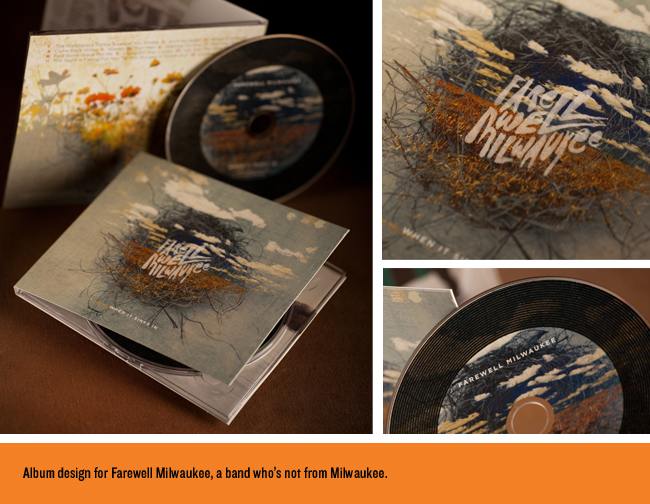
We were thrilled to be working with Farewell Milwaukee on their latest album release “When It Sinks In.” This is a band you should get to know if you have not already. They are from Minneapolis, MN, (don’t let the name fool you). We hope for big things from these great guys! While designing and conceptualizing images…
Read MoreDave Douglas CD Package Design, A “United Front”.
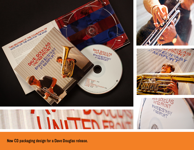
We were recently hired to design the latest CD release from two-time Grammy-nominated jazz musician/composer extraordinaire Dave Douglas. This is another one that started as one style (original illustration) and ended up being based on photography + typography. Still loved the process…Make SURE to check out some of the process below, as we show some…
Read MoreScrabbleriffic Merchandise Graphic Design for Wilco.
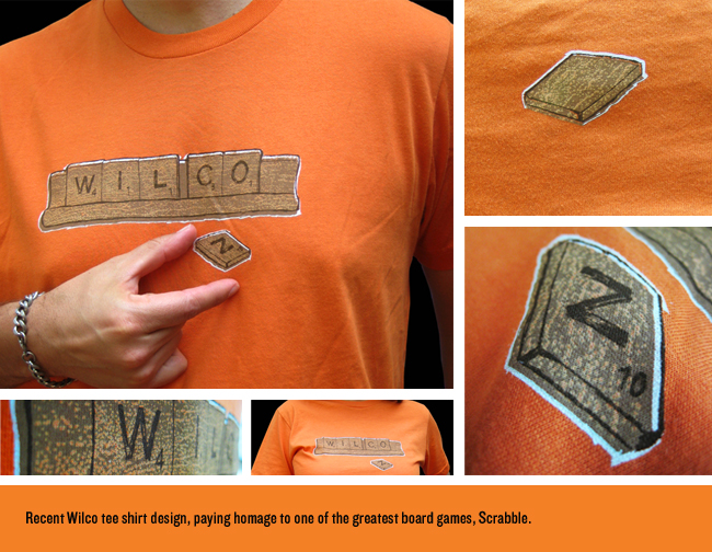
The idea for this Wilco tee shirt design came after a recent game of the classic board game played with friends. I lost, but this shirt won client approval. We went through several versions, some of which spelled different things like: “CALL WILCO WHO ROCK”, “ON NIFTY FEW”…you get the idea. Our thanks go out…
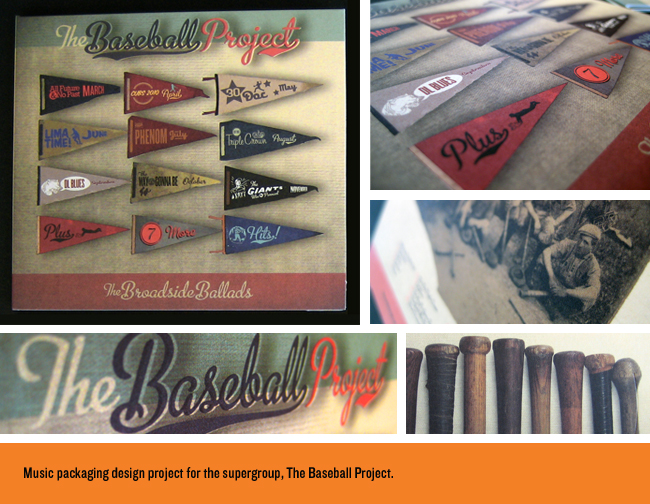
Read MoreCD Packaging Design Home Run for The Baseball Project.
We are fortunate to come across some really cool projects to get to work on now and again. This design project for the super group The Baseball Project was a real thrill and honor to get to produce. This band is is composed of Scott McCaughey (Minus 5, R.E.M.), Steve Wynn (Dream Syndicate, Gutterball), Peter Buck (R.E.M.), and Linda…
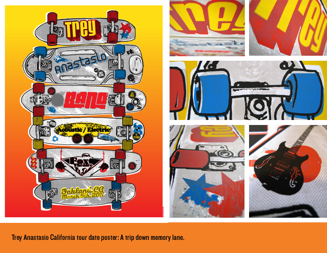
Read MoreTrey Anastasio Band Poster Design, 1970’s Skateboarding Is Alive And Well!
We really enjoyed working on our latest poster for the Trey Anastasio Band. The vibe we were after was vintage 1970’s skateboarding from California. Half the fun was researching (and reliving!) skateboard culture from the late 70’s (a time we hold dear here). Tons of images out there of old skate company stickers and decks…
Read More