Posts Tagged ‘print’
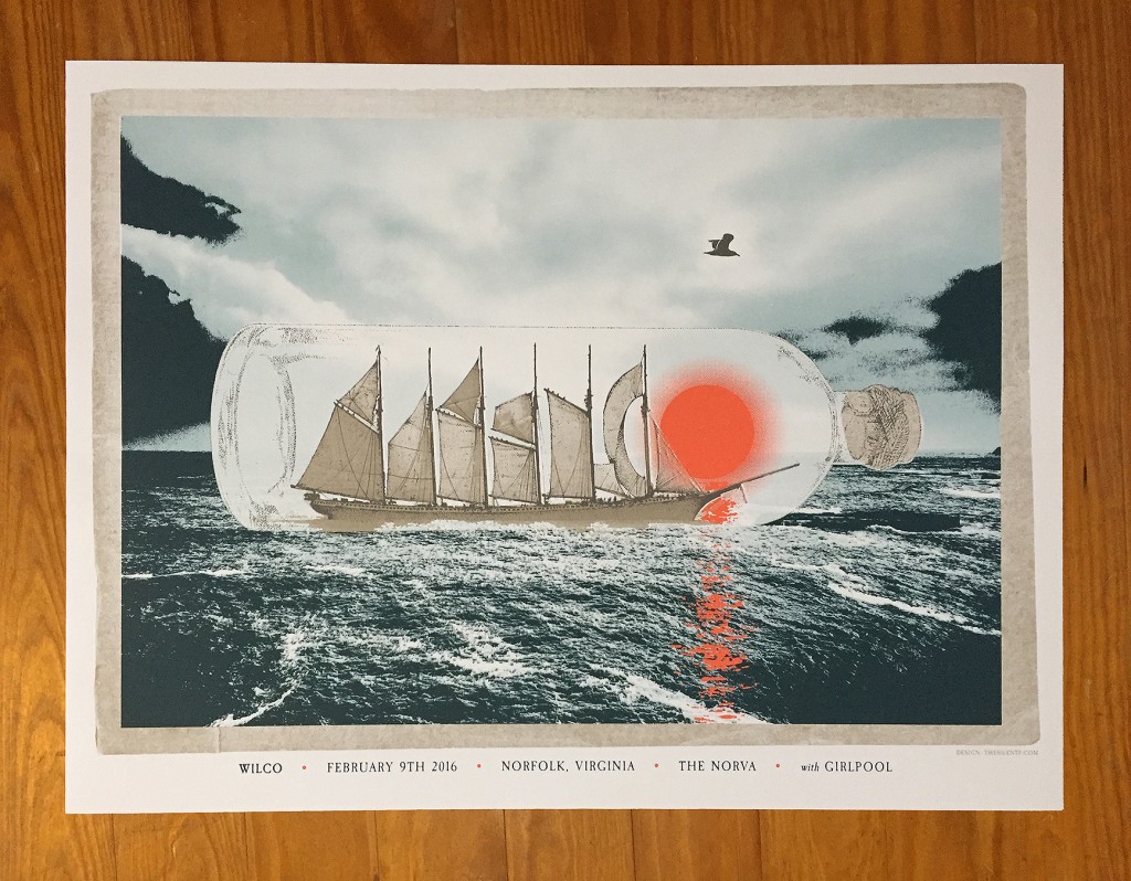
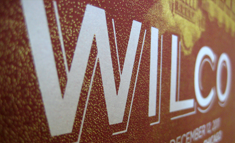
Wilco Poster Process.
Please indulge us in a little process post for The Silent P’s latest poster art created for the amazing band Wilco. For those with shorter attention spans, below is the entire process represented in a handy image gallery. Below the gallery is a more expansive detailed description of the process. We’d like to thank Dan…
Read MoreLots of Work, Little of Blog.
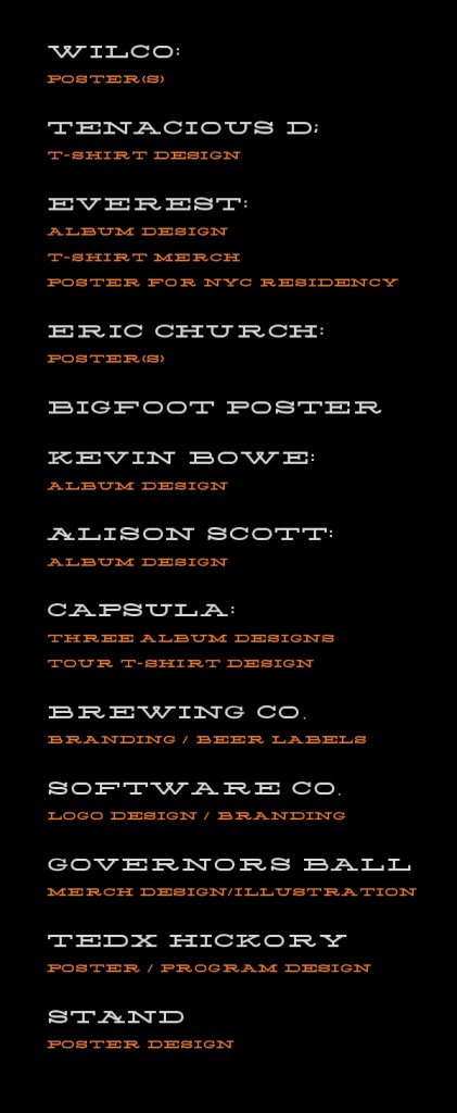
The Silent P has been… a bit TOO silent. The reason for the lack of updates is a great one though: WE ARE BUSIER THAN A ONE-ARMED MAN AT A HIGH FIVING CONTEST (clap sounds). So, to bring you up to speed (of sorts), here’s a partial list of some of the projects that have…
Read MoreAppreciate the Process.
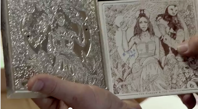
Bit of a re-post here: Highly recommend this video of the making of Gilian Welch’s latest release “The Harrow & The Harvest”. You really appreciate the work & process involved in making something unique and special. Let’s repeat that: You really appreciate the work & process involved in making something unique and special. Windmill presses, Ink,…
Read MoreAppreciating The Imperfect (and Hand-Done) Typography Around You.
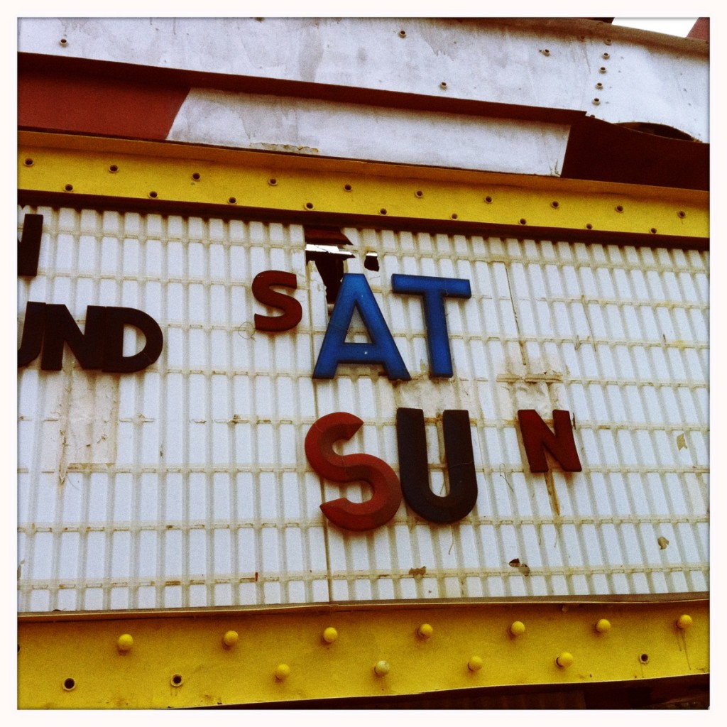
On a recent trip to our local Flea Market, we saw all sorts of fun and interesting items (edible cactus for one!). We also really dug all the hand painted old signs around the location. Here’s a selection of some sweet work that we think is more interesting than the “perfect” fonts and typography found…
Read MoreWilco’s Incredible Shrinking Tour of Chicago Poster Series
One of our favorite music clients and bands asked us to help create a complete poster series for “Wilco’s Incredible Shrinking Tour of Chicago”. Five dates, five different venues in Chicago. The deadline to accomplish the project was insane, to say the least. With help from some of our friends (you know who you are),…
Read MoreThe Gateway Arch, Water and Wilco.
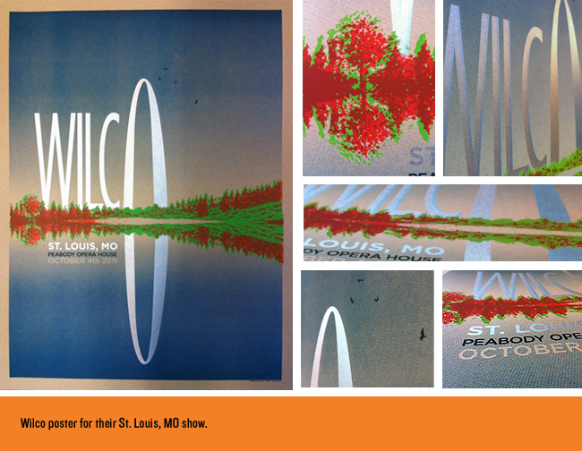
We recently finished up a poster design for Wilco’s October 4th show in St. Louis, MO. One of those little birdies to the right of the arch told us that these sold out at the show. Below are some of the process shots, details and even the initial idea as we sketched it out. Sometimes…
Read MoreWilco’s Solid Sound Festival at MASS MoCA.
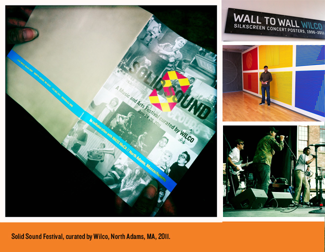
We recently got to attend this great event as guests in North Adams, Massachusetts curated by Wilco, one of our favorite clients. Thought it’d be nice to post some of the highlights from this arts + comedy + music weekend! We’re already planning on next years, but shhh, don’t spread the word too much, we…
Read MoreNew Album Packaging Design for Farewell Milwaukee.
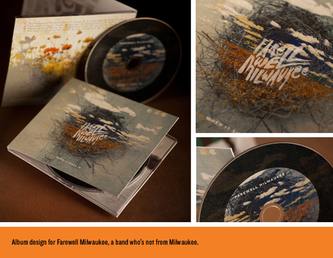
We were thrilled to be working with Farewell Milwaukee on their latest album release “When It Sinks In.” This is a band you should get to know if you have not already. They are from Minneapolis, MN, (don’t let the name fool you). We hope for big things from these great guys! While designing and conceptualizing images…
Read MoreDave Douglas CD Package Design, A “United Front”.
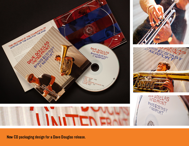
We were recently hired to design the latest CD release from two-time Grammy-nominated jazz musician/composer extraordinaire Dave Douglas. This is another one that started as one style (original illustration) and ended up being based on photography + typography. Still loved the process…Make SURE to check out some of the process below, as we show some…
Read MoreScrabbleriffic Merchandise Graphic Design for Wilco.
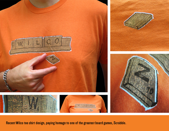
The idea for this Wilco tee shirt design came after a recent game of the classic board game played with friends. I lost, but this shirt won client approval. We went through several versions, some of which spelled different things like: “CALL WILCO WHO ROCK”, “ON NIFTY FEW”…you get the idea. Our thanks go out…
Read More